Design plays a large role at higher-end coffee shops. It’s often the most thought about aspect of a cafe, second only to what’s actually in the cup—and sometimes even taking precedence over it. But there’s good reason for holding this one particular non-ingestible facet in such high esteem. It’s the customer’s introduction to the shop’s ethos; it sets the tone, consciously or otherwise, for the overall cafe experience. Is the space warm and inviting? Is it clean and functional? Does it look like Liberace’s science lab blew up? These sorts of aesthetic qualities can be signals to us, the customers, of not just the quality and thoughtfulness in the beverage but of our role in the cafe biosphere, be the friend and neighbor, the joe-on-the-go type, or even the awestruck spectator of some bizarre performative science-art installation.
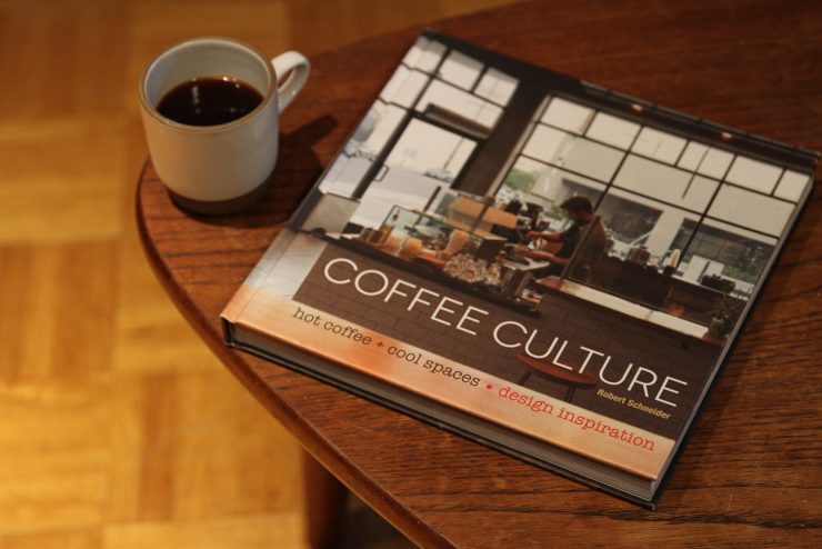
In his book Coffee Culture: hot coffee + cool spaces, former financier Robert Schneider explores the very important intersection of specialty coffee and high-minded design in American cafes. Schneider spent the better part of a year traveling the country visiting top-notch coffee shops for this project, his first book. The results are found in 224 pages representing 33 of the most beautiful cafes in America through gorgeous, full-color photography by a variety of talents.
I sat for a chat with Schneider via electronic communiqué to discuss Coffee Culture: hot coffee + cool spaces to get an inside look into how exactly he chose the cafes that ended up making the final cut, both in terms of design and coffee.

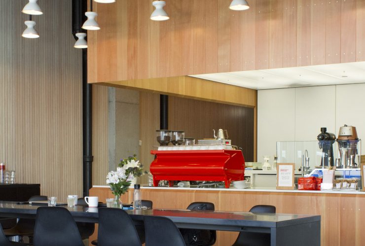
Intelligentsia, Wicker Park, Chicago. Photo by Allison Welch.
How did the idea for the book come about?
The origin is pretty simple. It came about from my two lifelong passions—coffee and design—so why not combine them in a book? The idea for the book existed for several years before gaining traction in late 2013, when the idea of a 220–230 page hardcover featuring 30–35 coffee shops solidified. The photo shoots took place primarily during the summer of 2014.
You’ve included shops from all around the country—Denver, Portland, St. Louis, New York, etc. You’ve got big name cafes like Stumptown and Blue Bottle but included lesser-known shops like Denver’s excellent Black Black Coffee. How did you find all these places?
The selection process involved researching primarily online and/or in person over 1,000 coffee shops to select those possessing top-tier coffee and top-tier design. But any shop that’s in the book, I visited and enjoyed a coffee or an espresso there.
Were you drawn to these cafes because of their coffee and found out they had amazing design or was it the other way around?
The process really worked both ways. I sometimes came across a shop with really good design and then was or was not convinced regarding the quality of the coffee. Conversely, I sometimes came across shops providing top-tier coffee and then was or was not convinced regarding the quality of the design.

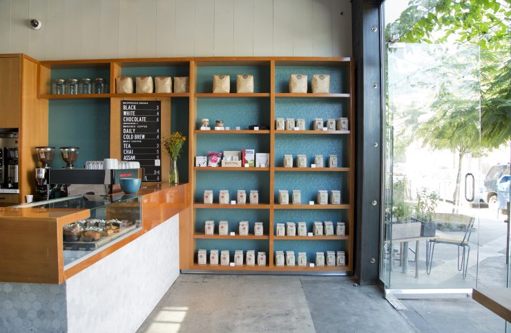
Blacktop Coffee, Los Angeles. Photo by Priscilla Rodriguez.
What were you looking for in the design? Was it a certain aesthetic, some particular design element, or was it more just a general feel?
The first thing I looked for was an interesting and inviting exterior, one that encouraged people to enter and explore. For the interior, I wanted something immediately appealing that also possessed standard design principles of balance, proportion, perspective, movement, variety (complementing and contrasting materials), rhythm, emphasis, harmony, and unity. But everything should come together as a unified whole; you know it when you see/experience it. These designs separate themselves from the ordinary by small details or the way the pieces have been put together, resulting in authentic spaces that have integrity and soul!
What cafe would you say exemplifies the sort of authenticity you are talking about?
Coava Coffee Roasters in Portland, Oregon. There are many coffee shops that attempt or try to replicate an industrial aesthetic, almost always unsuccessfully. Coava didn’t try to replicate that aesthetic—it just is that! It’s authentic, a unique space resulting in wonderful experiences!

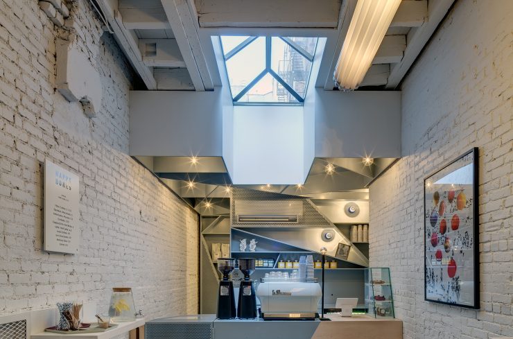
Happy Bones, New York City. Photo by Francis Dzikowski.
For the coffee bar design, was there anything specific you wanted to capture with this book?
I really like sleek, clean, low, level, and open coffee bars. That transparency invites interaction with baristas and allows for easy viewing of their art/presentation/theater. I wanted spaces where the brewing equipment and espresso machines—themselves functional pieces of art—were in full view to appreciate their wonderful design aesthetics.
On the coffee side, it was more than just design though. I looked for top roasters and multi-roaster coffee shops that appreciate and respect the entire seed to cup process. I put a lot of emphasis on shops that value direct relationships with farmers, small-batch and single-origin coffees roasted in a lighter style, career-oriented baristas, pour-over service, consistent quality, and a simple and straightforward menu.
What cafe do you think has “it”, that sort of “know it when you see it” experience?
Definitely the Intelligentsia in Wicker Park. There are many cookie-cutter, four-story apartment/condo buildings being built with retail coffee shops on the ground floor, but the Wicker Park Intelligentsia is just so unique. The apartment building was designed by Wheeler Kearns Architects (Chicago). The building increases population density without increasing traffic congestion as vehicle parking is not provided, which is a rather interesting idea. The building mimics the street pattern in the neighborhood and contains a 92’ by 27’ digital enlargement of a small watercolor titled Scorza by Antonia Contro. It’s very cool! The minimalist interior was designed by Daniel Wicke, also of Wheeler Kearns Architects. The space started out as a pretty typical rectangular retail shape but the end result is magical. The space possesses all of the standard design principles resulting in a special space that one recognizes and appreciates (as a unified whole) when visiting. You know it when you experience it, as seen in the facial expressions of two brothers in a wonderful photo in the book (page 165).
OK, last question. As a resident of Minneapolis, what are some of your home shops when you’re not traveling around the country?
I live on the far western edge of the metro and do not have a coffee shop within walking or biking distance to go to regularly. However, I have recently been driving a rather long distance to Anelace Coffee, a multi-roaster shop located in the Northeast Minneapolis Arts District. I also visit quite frequently Dogwood Coffee. Their quality is consistent whether it’s at the Uptown, Lake Street, or new Saint Paul location. I frequent the Spyhouse Coffee on Nicollet Avenue when visiting the Walker Art Center or Minneapolis Institute of Art. And Kopplin’s Coffee in Saint Paul is great. I try to get there occasionally even though it is a long way away from my house.
Coffee Culture: hot coffee + cool is out now and can be purchased at any major bookstore or directly through Images Publishing.
Zac Cadwalader is the news editor at Sprudge Media Network.
The post Coffee Culture: Hot Coffee And Cool Spaces appeared first on Sprudge.
from RSSMix.com Mix ID 8200593 http://sprudge.com/coffee-culture-interview-102953.html?utm_source=rss&utm_medium=rss

No comments:
Post a Comment